FROM ROB'S BENCH
Too much of a good thing?

Rob Brown

Blog for January 29, 2026
Two weeks ago, I wrote about a "simple project" I was making for my wife. We needed a two-step stool to reach items on the top shelf in the kitchen.
I didn’t want to turn this into a complex project, as we only needed a simple stool, but sometimes things have a way of getting away from me.
Inspiration from another magazine
If you’ll recall, the stool I’m making is modelled on one I found in an old Woodsmith magazine. It’s relatively simple, almost boring, really. It folds away nicely, so it doesn’t take up much space when not in use. I figured I’d create a very simple, basic structure, then add some adornment to it to create a piece that would make us smile when we used it.
That adornment, or at least the level I brought to this step stool, is one of the main topics of conversation in our home right now. I might have gone overboard.
How much is too much?
First, I made a very simple mock-up of little pink and red flowers on a piece of maple. My wife loved it. I thought it had a lot of potential. Things were looking up. With the mock-up in hand, I got to work on making the maple step stool. I’d worry about the decorative details later.
Build it first
To look at this stool, you’d think it was a very simple build. Now, I’m not saying it was overly complex, but without the detailed plans to provide accurate dimensions and angles, it was a bit trickier than I anticipated. A full-sized sketch on some plywood helped, but only so much. I was still guessing at what angles would be best. To be honest, I was also guessing at what the dimensions were. No worries, I’m a pro, right? I can build a step-stool, right? Above all, I told my wife it was a simple project, so I had to at least show her no weakness.
There was a lot of head scratching, but in the end, I won. The structure of the stool was complete. The last detail to add before applying a finish was to add the decorative elements I’d been thinking so much about.
Adornment
I made a second, larger practice panel, so I could hone in on a few more details. Since I was going to add milk paint to the carved recesses, I also wanted a panel I could practice on, before committing to the real thing.
The general plan was to add the adornment onto the front surface of the hanging stool. Since it would be hanging at least 99% of its life, that’s where it needed to look the most interesting.
The next step was to start adding the decorative elements to the step stool. I sketched the vines and flowers onto the blank, maple canvas that was the stool’s front surfaces. Because the pencil lines were somewhat dull, it was a bit hard to see the intricacies of how balanced the vines and flowers were on the surface. I didn’t want it completely symmetrical, though I also didn’t want the design to be too lopsided or uneven.
Change tactics, right away
After hand carving about seven flower petals with a carving gouge, I was searching for a new approach. The gouge, even though it was razor-sharp, was tearing out the grain when exiting the wood. Thankfully, I was still working on the mock-up panel. I tossed a rough, round carving burr into my Dremel and put it to work. It worked surprisingly well, though it was a bit too rough. I swapped the rough burr for a medium-textured burr, which worked quite nicely. An even, sweeping cutting movement resulted in a pleasing, natural-looking flower petal.
Next, I set to work on the stool. I power carved all the flower petals. Because they weren’t overly deep, it was still a bit hard to tell how densely populated the surface was with flower petals. I added a few more, as it looked a bit empty in some areas. The vines were next, which my sharp V-gouge took care of nicely. Flowing lines, with just enough intersections, was what I was after.
Once all the penciled-in vines were complete, it was still hard to get a good read on exactly how dense the details were. Were there enough on the step-stool? Hard to say, for sure. Stupidly, I added a couple more, to fill out some quiet areas.
Add some colour
I’ve used milk paint on many projects before, and I really like it. I mixed up some pink and started colouring all the flower petals. The plan was to colour the majority of each petal pink, then add some red towards the ends of each petal. The vines would be painted dark brown and the centre of each flower would be painted green.
Once I wrapped up all the pink and red I stood back. It was a bold look. Very bold! Next up, dark brown. It went on a bit tediously, but I got the job done. I sent a photo to my wife and told her, “I might have gone too far with this.” Either way, what was done, was done.
Finally, I was able to add the green to the flower centres. That’s where it stands now—in a flux state of maybe too much, maybe not. It’s a judgment call, really. If I didn’t make it, I might say the maker went too far with the design, but it’s hard to admit defeat, especially while the project hasn’t even had a finish applied to it, let alone ever been used.
I think my wife agrees with me, though she’s also biting her tongue, for now. It will still support someone 18″ off the ground, while they reach for a top-shelf item, but it might just look a bit bolder than was needed. Our home is pretty subdued, so this may look slightly out of place, but it will certainly be eye-catching. I’m sure there will be many conversations that start with this piece, which is part of the point of making your own woodworking projects.
I’m going to hold off on applying a finish to it, as I’ve got a set of three vanities to make that will get the same finish applied to them. No sense setting up and cleaning my Fuji spray equipment more often than needed. And I still need to figure out if I like this stool or not, before I bring it home. The life of a woodworker can be an emotional rollercoaster.
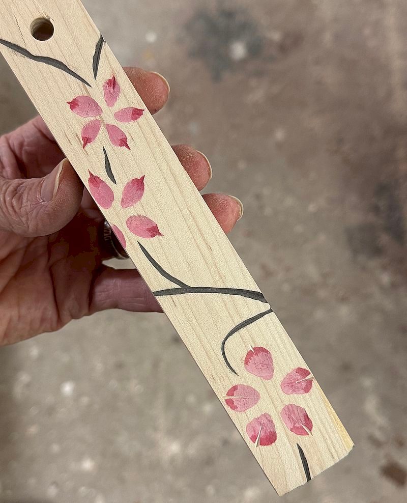
Small Sample
I made this tiny sample, mainly to show my wife my idea. It also allowed me to check out how well the carving / painting effect worked.
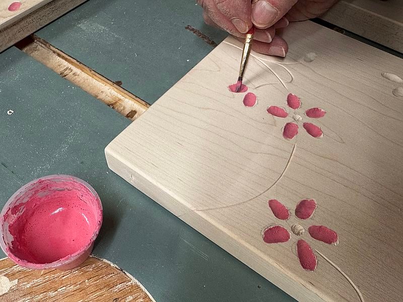
First Colour
Pink was applied first. I didn't worry about getting it all the way out to the tip of each petal, as the red was going to cover those areas. I also didn't worry too much about getting small amounts of paint on the main faces of the project, as I knew I could sand off any errant paint later.
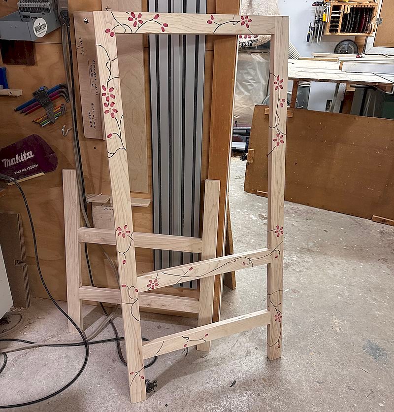
The Main Frame
Here's the main section of the step stool, with all the flowers and vines on it. Striking, for sure. Maybe too much so!
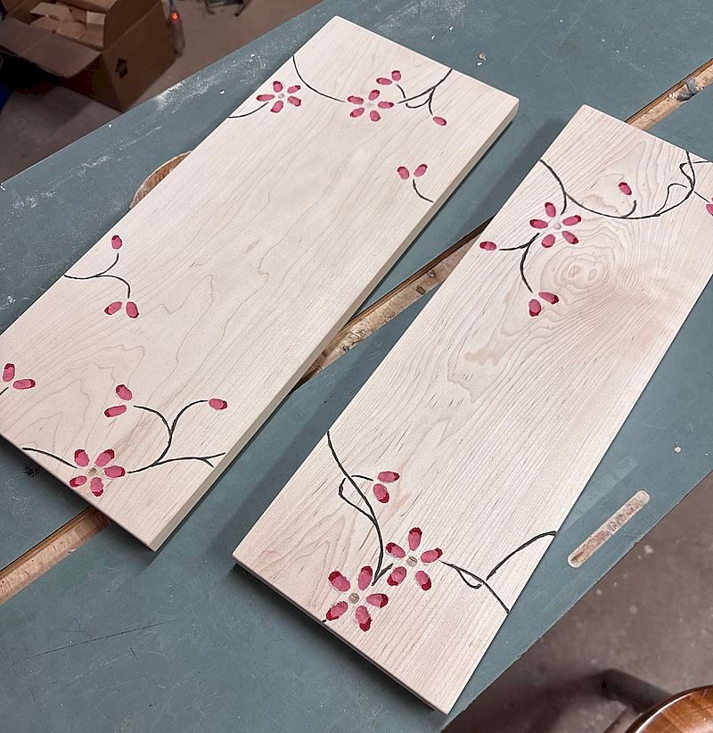
The Steps
These are the two main steps.
Layering Colours
Here, you can see the different layers of colours being built up, adding depth to these details.
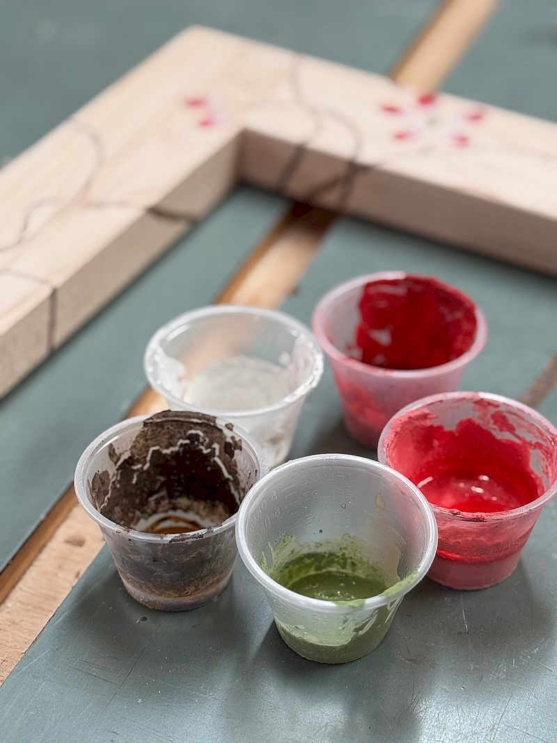
Leftovers
Here are the small batches of colours I mixed up, with the nearly finished frame behind them.


Nicely done Rob! It looks just right; a pleasant statement on an otherwise utilitarian piece.
Where is a picture of the completed project? Or is it not complete yet(other than the finish?
Terry,
The final assembly is actually going to happen once it’s been finished. That was just a slightly weird way that I made it. In another week or two I’ll have it all sorted and post some images.